Modals in Angular 17: An In-depth Guide
Creating modals in Angular can be a daunting task. There are many challenges that come with implementing a modal in a way that is accessible and consistent across different browsers. However, by utilizing the native HTML dialog element, many of these challenges can be mitigated. This article will walk you through the process of implementing a generic and accessible modal in Angular 17, highlighting the crucial aspects that you need to be aware of in order to succeed.
Overview
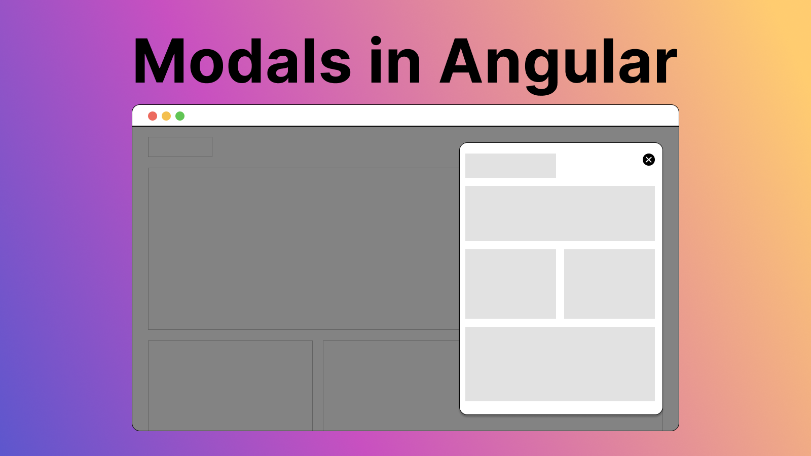
In essence, a modal is a UI element that displays content in a layer above the main application interface. It is commonly used for tasks that require user interaction, such as form submissions or content previews. Despite their ubiquity, creating a modal that is both functional and accessible can be a challenging task.
One of the primary challenges in implementing modals is ensuring consistent behavior across different browsers. This is where the native HTML dialog element comes in. This element provides built-in methods for opening and closing the modal (showModal() and close(), respectively), which removes the need to manually manage the modal’s open state.
However, there are a few things to note when using the dialog element:
- You cannot use the open property to control the modal’s open state using Signals or RxJS observables.
- The dialog element makes it easy to enable and modify the backdrop, which is a pseudo-element that can be styled.
- By using ng-content, the drawer can be used as a wrapper for different content. I use an
EventEmitterin the child component to output actions that occur on the content part.
Implementation
Here is a complete example of a modal implemented using the dialog element in Angular:
// drawer.component.ts
import { CommonModule } from '@angular/common';
import { AfterViewInit, Component, ElementRef, ViewChild } from '@angular/core';
import { SvgIconComponent } from '../svg-icon/svg-icon.component';

@Component({
  selector: 'example-drawer',
  standalone: true,
  imports: [CommonModule, SvgIconComponent],
  templateUrl: './drawer.component.html',
  styleUrls: ['./drawer.component.scss'],
})
export class DrawerComponent implements AfterViewInit {
  @ViewChild('dialog') dialog!: ElementRef<HTMLDialogElement>;

  closeModal() {
    this.dialog.nativeElement.close();
    this.dialog.nativeElement.classList.remove('opened');
  }

  openModal() {
    this.dialog.nativeElement.showModal();
    this.dialog.nativeElement.classList.add('opened');
  }

  ngAfterViewInit() {
    this.dialog.nativeElement.addEventListener('click', (event: MouseEvent) => {
      const target = event.target as Element;
      if (target.nodeName === 'DIALOG') {
        this.closeModal();
      }
    });
  }
}
<!-- drawer.component.html -->
<dialog type="modal" id="dialog" class="drawer" #dialog>
  <ng-content></ng-content>
</dialog>
// drawer.component.scss
.drawer {
position: fixed;
right: 0;
top: 0;
width: min(90vw, 40rem);
margin-top: 1rem;
margin-right: 1.5rem;
margin-left: auto;
height: calc(100% - 2rem);
border: none;
padding: 20px;
background: #fff;
box-shadow: 0 0 10px rgb(0 0 0 / 50%);
overflow: auto;
border-radius: 0.375rem;
&.opened {
animation: slide-in 0.75s forwards;
}
&:not(.opened) {
animation: slide-out 0.75s forwards;
}
}
// Styles the backdrop of the dialog
dialog::backdrop {
background: var(--neutral-black, #000);
opacity: 0.2;
}
// Slide in animation
@keyframes slide-in {
0% {
transform: translateX(100%);
}
100% {
transform: translateX(0);
}
}
@keyframes slide-out {
0% {
transform: translateX(0);
}
100% {
transform: translateX(-100%);
}
}
@media (prefers-reduced-motion) {
.drawer {
&.opened {
animation: none;
}
&:not(.opened) {
animation: none;
}
}
}
// Example of an inner-drawer
import { CommonModule } from '@angular/common';
import { Component, EventEmitter, Input, Output } from '@angular/core';

@Component({
  selector: 'example-inner-drawer',
  standalone: true,
  imports: [CommonModule],
  templateUrl: './example-inner-drawer.component.html',
  styleUrls: ['./example-inner-drawer.component.scss'],
})
export class ExampleInnerDrawerComponent {
  private _data?: Data[]; // Example type

  @Input()
  set data(value: Data[] | undefined) {
    this._data = value;
  }

  get data() {
    return this._data;
  }

  @Output() closeDrawerEmitter = new EventEmitter<void>();

  closeDrawer() {
    this.closeDrawerEmitter.emit();
  }
}
<!-- Example of html file where drawer and inner drawer is used together with Emitter -->
<example-drawer>
<example-inner-drawer
[data]="(chosenDataForChosenPoint$ | async) ?? undefined"
(closeDrawerEmitter)="closeDrawer()"
></example-inner-drawer>
</example-drawer>In this example, the dialog element is used to create a modal that can be opened and closed using the showModal() and close() methods, respectively. The modal’s open state is controlled using the opened class, which is added and removed using the openModal() and closeModal() methods.
Conclusion
While implementing a modal in Angular can be a challenging task, the dialog element provides a powerful tool that can simplify the process. By using this native HTML element and following the best practices outlined in this guide, you can create a modal that is both functional and accessible.